Page 1 of 1
Kroger: Taylor, MI
Posted: 26 Aug 2008 20:28
by submariner
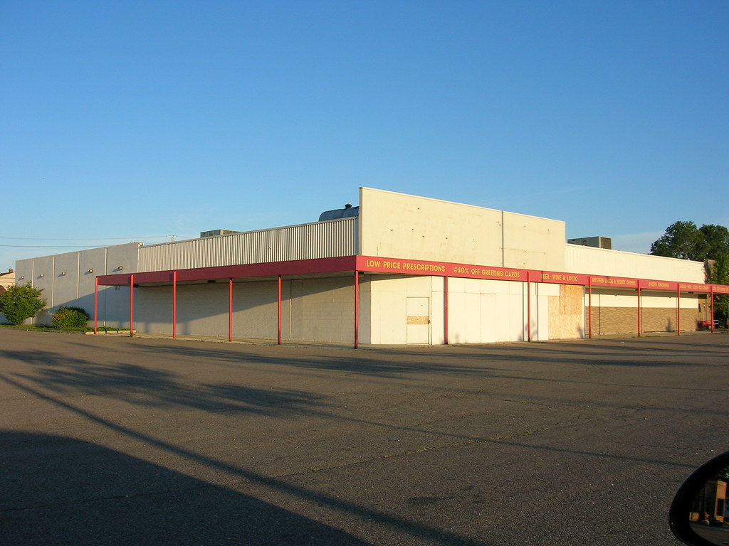
There's a Kroger here n Telegraph road that closed in the late 90's, which gave way to an F&M Drugstore before their demise. This Kroger predates the "Supercenter" concept, but I'm unsure by how much... any ideas?
http://flickr.com/photos/ssbn737rm/2801731700/
Re: Kroger: Taylor, MI
Posted: 03 Sep 2008 00:59
by h8wlmt
I'd guess that it was originally built in the late 50's or early 60's. You can see where the original side entrance has been bricked up. The back half, after the red awning, looks very early superstore... look at some of AndrewT's posts elsewhere on this board. I'd guess it was remodeled in the early 70's contrary to what Kroger usually did during this time period. Interestingly, I can count at least 4 different kinds of brick on this building. If I'm guessing right, there are many stores around me that share this design, sans the addition in the back.
Re: Kroger: Taylor, MI
Posted: 03 Sep 2008 08:42
by Groceteria
Seems to be a similar design to the (now-demolished) downtown Greensboro NC store:

Looked like this after it had been converted to county offices and right before it was torn down:

I agree that the "panels" were probably an addition in the superstore era.
Re: Kroger: Taylor, MI
Posted: 03 Sep 2008 09:57
by submariner
Thanks for the info!
If I recall, the interior it had had a lot of neon, I think... probably an 80's theme? Does anybody have pictures of Kroger's interiors from that era, after the "groovy greenhouse" graphics, and before the graphics of the mid-90's?
Re: Kroger: Taylor, MI
Posted: 03 Sep 2008 21:16
by Groceteria
submariner wrote:Does anybody have pictures of Kroger's interiors from that era, after the "groovy greenhouse" graphics, and before the graphics of the mid-90's?
I looked and I don't really have any, but that's the one we've referred to previously as the "grid" interior. It was neon lettering on a grid background, and the whole effect was very pink and red (although I've seen some color variation too). It was a late 1980s style, and there are some stores scattered around that still have it, although several of those have in NC and SC been replaced with the Ralphs style interior in the past couple of years.
Re: Kroger: Taylor, MI
Posted: 03 Sep 2008 21:30
by Andrew T.
Groceteria wrote:I looked and I don't really have any, but that's the one we've referred to previously as the "grid" interior. It was neon lettering on a grid background, and the whole effect was very pink and red (although I've seen some color variation too). It was a late 1980s style, and there are some stores scattered around that still have it, although several of those have in NC and SC been replaced with the Ralphs style interior in the past couple of years.
Did some implementations of the "grid" interior actually use real neon lighting for the lettering, and if so, could that have been a characteristic of new buildings and/or earlier remodelings in the timeframe only? While I'm familiar with the decor (thanks to so many '70s and '80s stores being remodeled in the early '90s), I've never seen any implementations that used real neon...
Oh well. I wish I could have seen this store when it was still open!
Re: Kroger: Taylor, MI
Posted: 07 Sep 2008 20:31
by krogerclerk
Andrew, the original grid decor was referred to as "90's neon" internally at Kroger and was introduced around 1987 in Lexington, KY. The decor originally debuted in late greenhouse era stores and a few extensive remodels. Atlanta, Houston, and Cincinnati received the bulk of these decor packages, as during the 87-94 timeframe, new store construction and remodels were limited due to the debt level Kroger carried after fending off the hostile takeover attempt by the Dart Group and declining KKR's white knight offer. New store construction was focused on these three divisions during that timeframe, with other divisions receiving only one new store per year.
The neon lights were often burning out by the mid-90's, thus the need for expensive upkeep. The colors varied by department. If you want to get technical only red is neon. Produe had "The Kroger Garden" in green, Seafood had "Fresh Catch" in white, Meat department had "Choice Cuts" in red, dairy in white "The Kroger Dairy", bakery white "Pastry Shoppe", and deli in read as "The Kroger Deli." The primary background color was mauve with the grid pattern.
Most remodels received the less expensive non-neon grid decor. A later neon package at Cool Springs Galleria in suburban Nashville used solely white neon on a hunter green background. The first Atlanta area neon store was in Snellville across from an A&P Futurestore, and in great contrast to the A&P's stark black and white decor. A billboard advertised "Snellville, your future has arrived" for the new Kroger.
A more rare decor package from the mid-90's can be found in the Atlanta area and the downtown Savannah store. Red and Chrome are the primary colors with some of the aforementioned hunter green elements in an Art Deco style package that uses neon marquis signage for each department. The Kroger greenhouse near Cumberland Mall Atlanta was remodeled to this package.
The less expensive millenia decor, some common in many Krogers seems to have rapidly replace the neon decor. I'm sure the maintenance of the lighting was a big factor.
Re: Kroger: Taylor, MI
Posted: 09 Sep 2008 12:50
by robdude
I have a picture of this store somewhere in my collection of it as an F&M (large format pharmacy) while it was still open as that. I remember it being a Kroger- it closed sometime in the mid-late 90s around the time the Farmer Jack opened in the vicinity. The Kroger sign was the one with the black letter inside the white box and it had one of the ovalish signs with some combination of delicatessen and bakery, possibly both.