I recently drove through Aberdeen, WA and noticed the Sears there still has the older style sign used until the mid-80s. This got me wondering if any other chains still have older signs in use. The ones that came to mind are: JCPenney (specifically the era they were called Penney's), K-mart (the old red-and-green logo), Macy's (wondering if they had any other logo, as I have never saw a store until their recent rebranding. however, The Bon Marche did have several older signs in use right up until the Macy's changeover), and to a lesser extent, was wondering if Target and Wal-Mart ever used a different logo.
There are stores in my area using older logos. The soon-to-be-closed Mervyn's still has older logos on some stores in Portland, I believe the one in Clackamas still has brown lettering, but I have also seen a few where the old logo was redone in the newer colors. Fred Meyer still has all three versions of their logo in use. Rite Aid also has a couple different versions in use, and most if not all of the Circuit City stores in the area still have mid-90s signage. Sears latest logo has not come to the area yet as far as I can tell.
I am not interested in grocery stores in this thread, but am more interested in major non-grocery chains.
older major non-grocery chain signage
Moderator: Groceteria
-
TheStranger

- Veteran
- Posts: 725
- Joined: 18 Sep 2006 01:26
- Location: California
Re: older major non-grocery chain signage
While Wal-Mart's logo per se hasn't changed, some of the 1970s/early 1980s stores located south of Frankfort, KY down through Danville on US 127, use an older font.Super S wrote: and to a lesser extent, was wondering if Target and Wal-Mart ever used a different logo.
Walgreens has not changed its lettering shape since the early 1960s as least (as photos in Chain Store Age issues of that era show the still-in-use font), though I'm not sure if they had the current logo.
KMart Australia never abandoned the full-lettered logo of the past, but did freshen up the font a bit.
Though not in the US, some Woolworths locations in Mexico still use the fun, 1970s-font design.
Last edited by TheStranger on 02 Dec 2006 17:35, edited 1 time in total.
Chris Sampang
-
justin karimzad
- Veteran
- Posts: 270
- Joined: 14 Nov 2005 01:23
- Location: California
-
TheStranger
- Veteran
- Posts: 725
- Joined: 18 Sep 2006 01:26
- Location: California
Here's a theory I had, originally when thinking about Safeway's circle S, but also applying to non-grocery as well:
Could the retention of older signs at a few select locations be designed to keep an older design trademark alive?
Albertsons claiming in its legal battle with Grocery Outlet that "using Lucky carts" was keeping the trademark alive seems a bit ludicrous, but you'd think these companies would be on even better legal ground with the complete usage of the old logos.
Chris Sampang
Well, Storewanderer has a pic of a Kmart in Sacramento that still has the old Kmart logo on it. There is reportedly one in Nebraska that also has the old logo on it too.
Up until a couple years ago I knew of a Penneys in Missouri that had the OLD Penney's logo (the current one has been in use since at least the 70s)
Macy's has a few older signs up at its flagship in NYC.
As for Wal*Mart there are 3 different versions of the logo:
1. A westernish style that says W A L ~ M A R T (This was retired in the 80s, I don't believe a single store has them, although some trucks still do!)
2. The modern W A L - M A R T (There a few stores that still have this one, including 845 in Buffalo, MO)
3. And today's WAL * MART which most stores have.
Another chain to use old logos heavily was Wards. Wards had no less than 3 different logos in use in its stores. There were the 70s logo, 80s logo and the last logo in use on stores until they did fold shop in 2001. There were at least half a dozen Wards that had just completed remodels at the time of Wards closure (the one in my town had JUST completed its remod the day they announced it was closing)
We have 2 Steak N Shake restaurants here in Missouri that still have their original retro signage from the early 60s on them.
Mervyn's was famous for keeping old logos on stores until like 2003 or so when Target (the then owner) started changing them all.
-
runchadrun

- Veteran
- Posts: 618
- Joined: 27 Dec 2005 14:29
- Location: Granada Hills (Los Angeles), CA
- Contact:
In some cases it's a matter of new sign ordinances where if they change the sign to the new logo it would no longer be grandfathered and would have to be smaller, less visible, or otherwise less desirable to the store.
Case in point is the former Alpha Beta at the corner of Santa Monica and Fairfax in West Hollywood. For years after AB switched to their green and yellow logo this store still had the old individual red and white letters and the large "Alphy" overhead sign in the parking lot. The store was originally built before West Hollywood incorporated and the code changed after incorporation. After the store became a Whole Foods the overhead sign came down and it was replaced with one closer to street level and the big cans on the front of the store were removed.
As for Rite Aid, they installed several versions of their sign during the Thrifty takeover. There was the red oval, the blue oval, red upper and lower case letters, blue upper case letters, and the red, white, and blue shield. I have never figured out why they didn't pick one design and stick to it when they were all going up at the same time.
-
wnetmacman
- Veteran
- Posts: 380
- Joined: 06 Nov 2005 23:48
There were actually plain variants of the Wal Mart signage before the western standardization. That signage only appeared on their first 200 stores, before what the company referred to as 'Concept 79' opened in Pine Bluff, AR, which was both the exterior and interior prototype for most of the stores built from 1979 to 1991. Wal-Mart phased the old, western logo out at that time. While it's still on the side of dozens of trucks, it was removed from all stores by roughly 1984. The Wal-Mart logo still found on a lot of stores has, for the most part, been modified to read Wal*Mart. The star in the center was supposed to be a permanent memorial to Sam Walton. It was added in 1992, and it now appears on almost every store, and every new one to be sure. Wal-Mart is very big on standardization.
Circuit City is one of the biggest users of their older logo. The newer stores have the big red circle. Most of the older stores still have the maroon front, as well as the old logo.
Prior to our local buyout of Eckerd Drugs by CVS, some of the local stores still had the 60's neon Eckerd Drugs signs on the front of them. They only seemed to replace signage on the higher volume stores.
Big Lots also still uses their old logo in many places as well.
What I would love to find is an old Ramada Inn sign from the 60s. There used to be one in Effingham, IL with the trumpeter on top of it, but as I understand, it's gone now.
Scott Greer
Sears in East Los Angeles on Olympic still has the old 1930's script on the original tower, 60's script on the store, and 70's type on the auto center across the street.
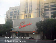

Even older, the Sears in Santa Monica still has the original signage from the 40's:

And the later script on the auto center:
 [/img]
Even older, the Sears in Santa Monica still has the original signage from the 40's:
And the later script on the auto center:
[/img]Of course the fast-food chains like to "retro" their logos...several McDonalds have brought back the classic golden arches look again...down to the "Speedy" logo on the signs. Then there is KFC with its stores of various designs and Colonel images. By the way, KFC wants to be known again as "Kentucky Fried Chicken" again, with their new packaging having the 60s style KFC lettering and a new version of the Colonel
-
Groceteria

- Great Pumpkin
- Posts: 1932
- Joined: 04 Nov 2005 12:13
- Location: In the breakroom
- Contact:
-
Groceteria
- Great Pumpkin
- Posts: 1932
- Joined: 04 Nov 2005 12:13
- Location: In the breakroom
- Contact:
Funny you should mention Ward's:Terry K wrote:Another chain to use old logos heavily was Wards. Wards had no less than 3 different logos in use in its stores.
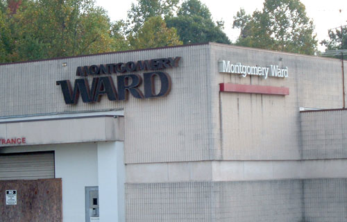
This is from a still-standing auto center next to the recently-demolished Carolina Circle Mall in Greensboro NC. Sometimes Ward's even used different logos side by side on the same building.
This particular store was a doozy too. It opened in 1976 with a really garish, exaggerated 70s modern facade that looked dated about a week and a half after opening. Still, it held on until the entire chain went under. When it finally closed in 2001, it was the last remaining tenant in the mall, and some departments still featured their orignal 25-year-old lime green and burnt orange shag carpet.
In Longview, WA, there was a Wards that retained its original red "WARDS" signs from the 1960s right until the end. Also worth noting, like the example Groceteria pointed out, they also had the 1970s signs with white lettering on one side of the building, and on the inside mall entrance. That mall, the Triangle mall, was demolished a couple years ago. Also worth noting, on a newer sign located by a building built on the mall property in 1992, was a Montgomery Ward logo which resembled the 80s style but had the later font style. That was the only sign like that I have seen.Terry K wrote:Another chain to use old logos heavily was Wards. Wards had no less than 3 different logos in use in its stores. There were the 70s logo, 80s logo and the last logo in use on stores until they did fold shop in 2001. There were at least half a dozen Wards that had just completed remodels at the time of Wards closure (the one in my town had JUST completed its remod the day they announced it was closing)
There was actually one other logo between the 80s and the end. The Montgomery Ward store at Jantzen Beach in portland, OR had one which somewhat resembled the 1970s version in how they placed the words, but used the font present in the final Wards logo.
<<Edited by moderator to properly frame quoted text. Click here for info on usage of the "quote" feature.>>
-
terryinokc
- Contributor
- Posts: 79
- Joined: 06 Nov 2005 23:34
-
TheStranger
- Veteran
- Posts: 725
- Joined: 18 Sep 2006 01:26
- Location: California
The Davis Gap (built about 5 or 6 years ago) actually has some posters with the older font going on, for a 1960s theme.Groceteria wrote:The Gap is starting to use its old logo (albeit selectively) again as well.jamcool wrote:Of course the fast-food chains like to "retro" their logos...
Chris Sampang